Built to Sell
PROJECT 004
PROJECT 004
Built to Sell
This The brief was simple on paper: create a contractor-focused retail space that could handle a serious amount of product without feeling like a warehouse with a cash register.
It needed to work for two very different audiences at once — professionals who knew exactly what they came in for, and their clients, who often needed help visualizing what those products could become.
So the design had to do more than look good.
It had to organize, guide, inspire and sell.
From there, every decision came back to the same question: what would make this business easier to shop, easier to understand and harder to walk out of empty-handed?
THE SHOWROOM
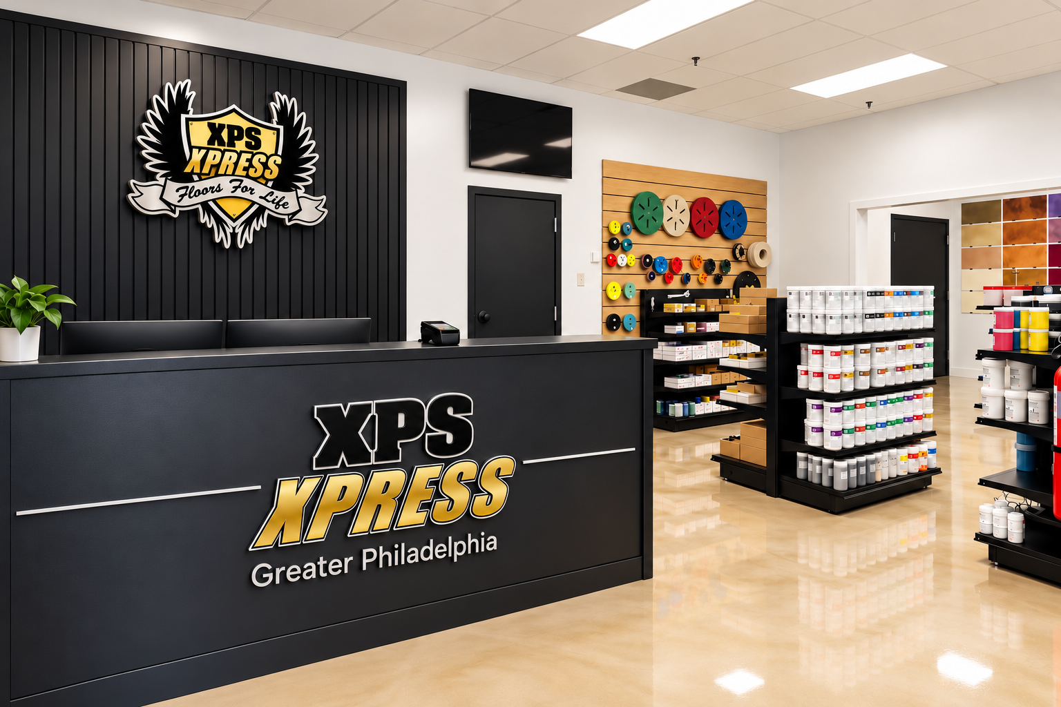
The front of the store was designed around what actually needs to be seen.
Anything heavy, liquid, or requiring a forklift stays in the warehouse. Anything hand-carry, visually important, or useful for comparing products lives up front.
The challenge was making a product-heavy space feel abundant without tipping into visual chaos. Black fixtures gave everything structure, warm wood softened the harder industrial elements, and the displays were organized to make browsing feel easy rather than overwhelming.
The goal wasn’t speed.
It was to make people want to look around.
FIRST IMPRESSIONS
The desk sits directly in front of the entrance for a reason.
The first thing a customer should experience is being greeted, not wondering where to go.
The custom desk and decorative wall behind it were built specifically for the space. The wall became the branding moment — complete with a full-color 3D logo — while also quietly hiding the bathroom behind it.
Pretty from the front. Practical from every other angle.
Exactly how commercial design should work.
THE SAMPLE WALL
The sample wall came from learning how this business actually sells.
Contractors bring their clients into the showroom to choose finishes, which means eventually someone is standing there trying to imagine what a little pile of pigment or a tiny color chart is going to look like across an entire floor.
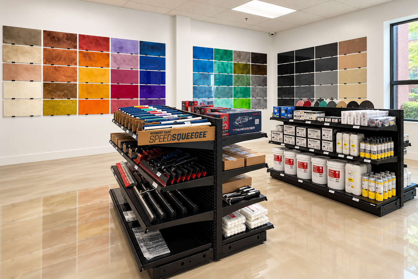
That is a lot to ask of a little chart.
So we gave them 72 real samples to look at instead — solids, metallics, glitters and flakes — all in one place, all big enough to actually compare.
The point wasn’t for us to become epoxy experts.
The point was to understand where the customer experience got awkward and design that problem out of the room.
THE SHOE
The sample wall.
Part merchandising, part inspiration, and a much better answer than “just picture it.”
THE FLOOR IS SELLING TOO
The showroom floor was intentionally finished in decorative metallic epoxy.
Partly because it looks good.
Mostly because customers should be able to see what the product can actually do.
Instead of pointing to a sample and saying, “Imagine this across a whole floor,” the answer is already beneath them.
That is a very large sample.
THE WAREHOUSE
The warehouse needed a completely different kind of thought.
No decorative metallic floor back here.
Just polished concrete — durable, easy to clean, and ready for forklifts, pallets, liquids and everything else the front of the store politely avoids.

Heavy product stays where heavy product belongs.
The showroom gets to inspire.
The warehouse gets to work.
They do not need the same personality to belong to the same business.
BUILT TO KEEP YOU LOOKING
This store was never designed for people to rush in, grab one thing and leave.
Quite the opposite.
The layout encourages contractors to look around, discover products they didn’t necessarily come in for, compare options and spend a little more time in the space.
Retail design gets talked about like it’s all mood and merchandising.
Sometimes it’s also very literally:
How do we help people find more things they want to buy?
A beautiful question, really.
EVEN THE BATHROOM HAD A JOB
The bathroom went completely black.
Walls. Floor. Vanity.
Partly because it looked good.
Partly because this is a contractor showroom, and white surfaces were never going to be anyone’s friend.
We can leave the rest to your imagination.
WHAT MADE IT MāREA
Thoughtful design belongs everywhere.
Not just in homes. Not just in beautiful restaurants, hotels or events. A contractor supply store deserves the same level of intention — it just needs that intention applied differently.
Here, beauty was never the only job. The space had to sell, organize, inspire, survive heavy use and make sense to the people working in it every day.
That’s what made this project interesting.
The point wasn’t to make an industrial business look residential or overly polished. It was to understand what the space needed to do, then design every part of it around that.
Because good design isn’t a look.
It’s paying attention.
That’s MāREA.